
photos: ©iStockphoto.com/photodjo
Color has a profound psychological impact on our lives. It’s used every day to stimulate our senses, excite us, calm us and, yes, induce us to buy products. Each color family has its own set of characteristics that trigger certain responses in us. With that in mind we should tread carefully when adding color to our space, especially our writing space.
There are trend colors, those colors du jour that we fall “in like” with. Be careful here because this relationship is a bit like infatuation. Color fatigue sets in quickly with trend colors. And before your know it, it’s time to move on to something else.
Then there are colors that last a lifetime – those are your favorite colors, the colors your intuition chooses. These are the colors that you feel close to and comfortable with. These are the colors that already appear in your closet and in the most comfortable rooms of your house.
When it comes to choosing color for any room, keep in mind that you don’t have to have an all red or all green room. Sometimes a dash of color is just enough to stimulate your creativity or get you in writing mode.
What follows is my take as a color marketer on color and how it can affect us as writers. Keep in mind that if you’re seriously engaged in the writing process, you’re focused and so you don’t see any color – it’s actually the absence of color, i.e. black type on a white page.
Red is a very stimulating color; it is the color of heat, passion and warning. It’s used a lot in fast food restaurants to move people in and out quickly. Use a dash of red to jump start your project.
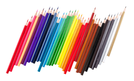
Purple is a mystical color. It promotes healing and meditation. Leonardo da Vinci said that the color purple can increase meditative powers tenfold. A purple room is good for contemplating plot and structure.
Blue is a very relaxing and calming color. If you’ve put yourself under the pressure of deadlines, then blue is the color for you.
Green is Mother Nature’s favorite color. And just look how creative she is.
Yellow is a high-energy color that stimulates the mental process of thinking and activates memory. If you’re writing a memoir a little yellow will go a long way.
Orange is a color you either love or hate. It’s also a high-energy color and encourages socialization. It might be a good color to use in a room where writers convene to discuss their work.
Whatever color you choose for your writing room it should be a color that enhances and promotes your personal well-being – as you feel it. Color like everything else in a room should disappear after a while as you engross yourself in your story. At that point your story’s own color will jump off of the page.
©iStockphoto.com/RuslanDashinsky

This is great – I would love to hear more about how colour affects our moods, desires and behaviour. What about pink? I’ve experienced a sense of quiet excitement when entering a room with strong, bold pink tones, or a sense of deep calm when wearing soft, translucent pinks. I think pink gets a bad rap as a “girly” colour. And the colour of the sky just after the sun sets and before the stars appear – for years I’ve been trying to come up with the right word to describe that blue. Perhaps you could enlighten us, Cat, as to how colours are named?
Lorrie, I could wax poetic over pink. It is fast replacing orange as my favorite color. And the hotter the better thanks to Elsa Schiaparelli – who gave us shocking pink.
Believe it or not psychological studies have been done on pink and they use a certain shade in police holding cells to calm the aggressiveness of prisoners. Also some sports teams have been known to paint competitive locker rooms pink!
I know that blue color – but to capture a name for that precise blue moment will take some pondering.
Most companies have a colorist or a staff of colorists who come up with the names of colors. I think OPI (nail polish) has some pretty fun/whimsical names. I named my own color collection, i.e. the bookmarks and had a ball. My only mandate was to have fun.
Joan Didion captures that color blue in her latest work entitled _Blue Nights_. While her book is about grief, her capacity to work with that color and describe it speaks to her brilliance as both observer and writer.
Kolleen – I just saw an interview with Joan Didion on the release of her new book. It slipped through the transom of my mind. Thanks for the reminder…I will download it to my Kindle today. It’s a lovely snowy New Year’s Day perfect for reading. We maybe name that color after all. Cat
What a great thought…I’ve never actually thought about it. I do love that purple in the picture you chose. And I LOVE your blog banner picture – makes me want to jump on in and get an expresso.
Thank you Cassie. I stopped by your blog and really enjoyed it. Thanks for adding to my reading list. I didn’t think it could get any longer – looks like I was wrong. 🙂 Should your travels ever take you to Montreal there’s always an open spot at the Cafe Girl table. And the espresso is amazing – Cat
I have thought about this, obsessed over it, and spent far too much time with it,. In the end I gave up and went white. I’ve regretted colour decisions before and ended up divorcing one room completely. It got possession of a very nice chair that I miss.
To avoid this mistake I painted the room white and while it works ( sunny room and all) I think I was not brave and it reflects in my writing.
My bedroom is duck egg blue and sooths me, and I resisted doing the same where I write thinking I would fall asleep. Signs, more thinking is needed.
Keep in mind that it’s a lot easier to make over a room than a man. Don’t like the color – don’t divorce yourself from the color. Try a break over instead with a new color. The nice thing about color is if you don’t like it, you can always change it! White is great especially if there’s lots of light. A few colorful accessories might be the only thing you need.
My bedroom is Bordeaux red – the color of a jewelery box lining. I try to remember that when I drift off to sleep.
I nominated your blog for two awards because Iove it and I wanted to share it with others. You can find more information here: http://narcissistsblog.wordpress.com/2011/12/30/drum-roll-please/.
Love – Teri
Thank you Teri! I really enjoy reading your blog. Our paths crossing was serendipitous. I love those sorts of things. I hope you have a wonderful 2012 filled with good things. Cat
Color fatigue – that explains the country blue/mauve era.
I’ve found that as I’ve grown older the colors I’m drawn too change so often. Not too long ago it was Turquoise. Then orange (I’ve always been repulsed by orange and yellow. Go figure?)
Right now I’m in what I call my purple stage of life.
I love my writing room. Ended up with colors I never thought I’d use. Bright orange throw rug, purple bed spread and pillows on the trundle guest bed, collection of red Elmos, multi-colored butterflys on wall, walls are painted very pale lavender, and a multi-colored purple/hot pink/orange fringed shawl/drape.
Interesting post! Enjoyed it very much 🙂
You know Ann – you’ve given me an idea for some research for the (day) job and fodder for the blog. Do color preferences change over time? And if so, what leads to these changes? Does it happen often? I’m experiencing the same thing myself. I have always been an “orange” girl but lately it’s all about pink. I think it’s a latent reaction to the lack of pink in my childhood.
My mom hates the color so I never had any pink clothes. Plus she explained that as a redhead, I looked better in blues and greens. Now I own pinks (all shades)and I especially love an orange/fuchsia combination.
I love your writing room colors – the ecclesiastical purple combined with the pagan orange with a touch of red. Very inspiring! Glad you liked the post. Cat
I can’t wait to read the results of your research!
When my daughter, Shelley, was in grade school I fixed up her room one day while she was at school – new bedspread (pink, baby blue, purple hearts on white), pink curtains, even a brand new pink robe and pj’s spread out across her bed. When she got home I sent her into her room to discover the surprise on her own. She came into the kitchen where I stood, gave me a huge hug and exclaimed, “OH thank you Mommy! But I HATE pink!” LOL
Her room ended up gray and earth tones with a gray wolf/Native American theme. It was very relaxing.
OMG! After all that…you’ve got to love kids. Ann your heart was in the right place – you were just viewing the world with rose colored glasses.
My office is the color of the Serengeti – golden and grounded. It’s very soothing. It’s extremely necessary because the day job is often stressful. So it’s a nice balance.